Backtesting Moving Average trading strategy
Source codeIntroduction
During every Chinese New Year, I receive some money from my parents, grandparents, and other relatives and friends. I have been investing this money in technology stocks such as Apple, Tesla, Amazon, Microsoft, Tencent, and others. My simple investment strategy is to buy the stocks of the companies which a lot of us use the products of. Following the technology boom in 2020, I made significant profits. However, I experienced a significant loss when the market underwent a drawdown towards the end of 2021.
To mitigate such drawdowns and participate in market rallies, I turned to YouTube for guidance. There are numerous stock trading videos that teach strategies to avoid drawdowns and identify market rallies. One of the most popular tools recommended is the Simple Moving Average (SMA or MA) with a period of 200 days. Many content creators advertised SMA 200 as a miracle, able to participate in the market rallies while avoiding drawdowns. I was sceptical about that as it sounded too good to be true and I built a backtest model to test this popular strategy using Python.
After carefully backtesting the SMA strategies, a clear disparity emerges. Investment videos, particularly those seeking to attract paying customers, often emphasize a wrongly backtested SMA strategy that showcases remarkably high returns. This can lead to unrealistic expectations. In contrast, the correctly backtested SMA profit, which is rarely disclosed, provides a more realistic perspective.
I hope my careful research and backtest can help many investors become more careful while surrounded by much unsound paid investment advice. In addition, the backtest framework can be used for testing other trading strategies, or even apply AI models on it in the future. It again shows I become much more resourceful with the help of Python programming.
Data and Method
The Simple Moving Average (SMA or MA) trading strategy is a popular technical analysis approach used by traders to identify potential trend reversals or entry/exit points in financial markets. The strategy involves calculating the average price of an asset over a specified period and using it as a reference for making trading decisions.
Here's how the Simple Moving Average trading strategy typically works:
- Select a time period: Determine the time period for calculating the moving average. Common choices include 50 days, 100 days, or 200 days. In this example, I choose 200 days.
- Calculate the moving average: Add up the daily prices of the stock over the selected time period and divide it by the number of days to get the average. This forms the moving average line.
- Monitor the price movement: Compare the current price of the stock with the moving average line. If the price crosses above the moving average line, it may indicate a positive signal, suggesting a potential uptrend. Conversely, if the price crosses below the moving average line, it may suggest a negative signal, indicating a potential downtrend.
- Make trading decisions: If the price crosses above the moving average line, you should buy the stock to participate in the market rally; if the price crosses below the moving average line, you should sell the stock to avoid drawdown.
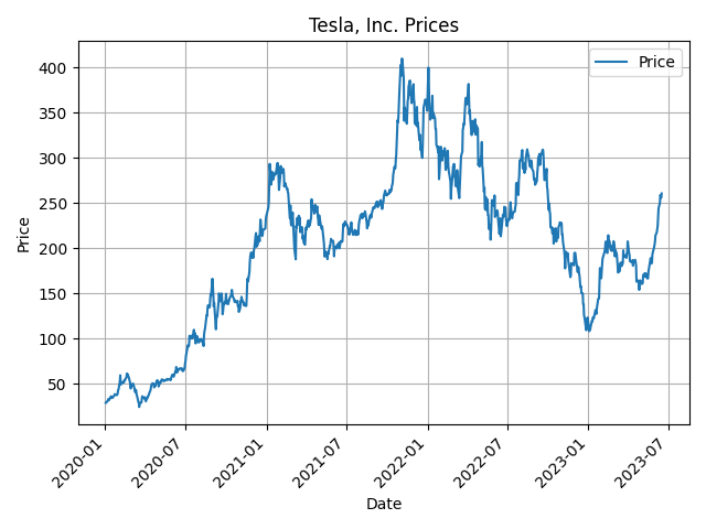
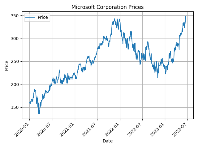
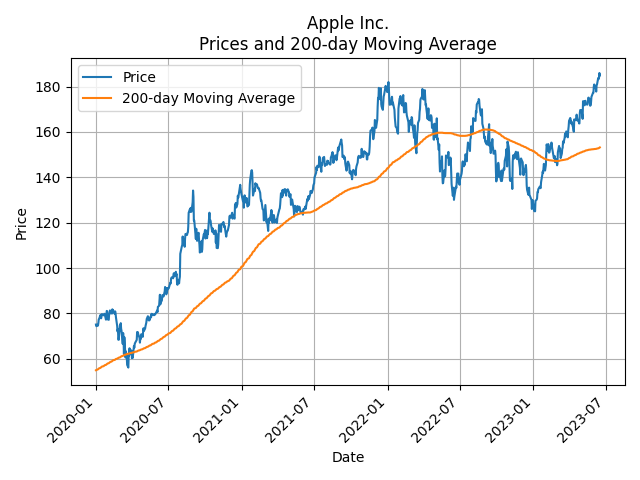
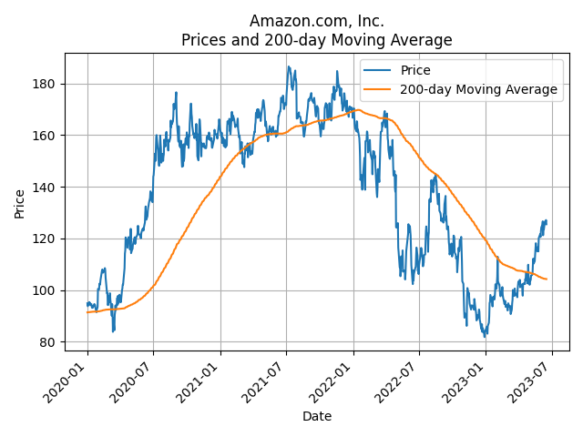
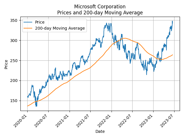
The yfinance (Yahoo Finance) package is a powerful tool in Python for downloading historical stock market data. It allows users to fetch data directly from Yahoo Finance. To illustrate, I show the prices of Tesla and Microsoft from 2020-01-01 to 2023-06-16.
Results
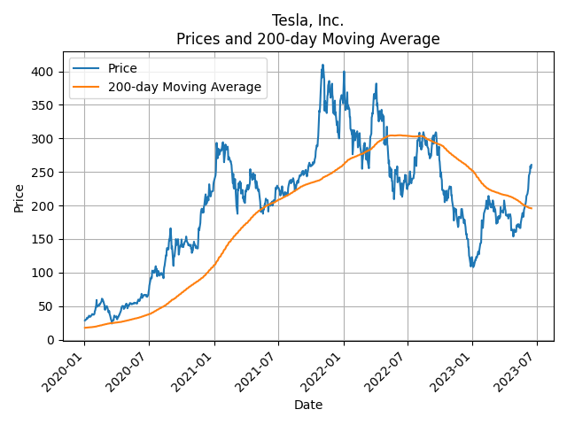
In the plot displayed above, I have depicted the daily price movement of my favourite stock, Tesla, from January 2020 to Jun 2023. Additionally, the 200-day moving average line has been included in the graph. By observing the plot, it becomes evident that when the stock prices rise above the moving average line from beginning of 2020 to beginning of 2022 and just recently. It serves as a clear positive signal, and you can make quite some money if you hold this stock during this period. Conversely, when the price crosses below the moving average line from beginning of 2022 to recently, it signifies a negative signal, suggesting a potential drawdown, and you should sell this stock just when it happens.
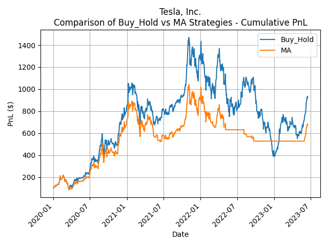
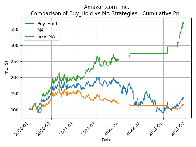
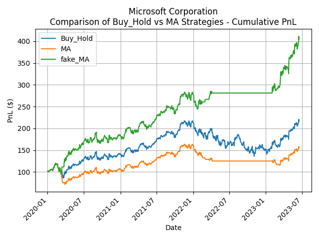
It sounds quite easy to be successful in investing in stock markets. And it is what most youtubers hope to achieve as shown in the following graph. The orange line represents the profits and losses of the SMA 200 strategy, while the blue line represents the profits and losses of the buy-and-hold strategy. The buy-and-hold strategy simply means I keep the stock throughout this period, and it serves as a benchmark to assess any dynamic trading strategy. As shown by the following plot, the moving average strategy makes significant profit than simply holding the stock. Thus, we always participate in the market rally and avoid market drawdown.
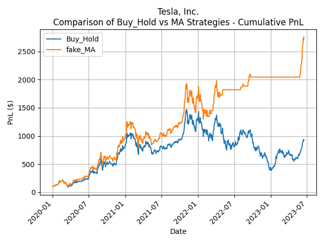
However, during my careful backtest, I found out this performance line is not realistic and wrongly backtested. Many people misaligned the prices and signals. They forgot the signals are only known after the prices are available for the day. So, they can only trade the signal the next day and it means we should have shifted the signal by one day. As the below graph shows, this small mistake has a huge impact on the backtested performance. Thus, I name the above graph as the fake SMA line as they are usually shown by many so-called investment experts in their YouTube videos.
After conducting a careful backtest, the plot below illustrates the profit and loss (PnL) of the correctly backtested SMA 200 strategy. While the SMA still generated okay performance, it falls short of the performance of a simple buy-and-hold strategy. This indicates that the real SMA 200 strategy does not live up to the claims made by numerous investment gurus. We could have used the time and effort to do other useful things in life rather than trading in-out in the stock markets following this strategy.
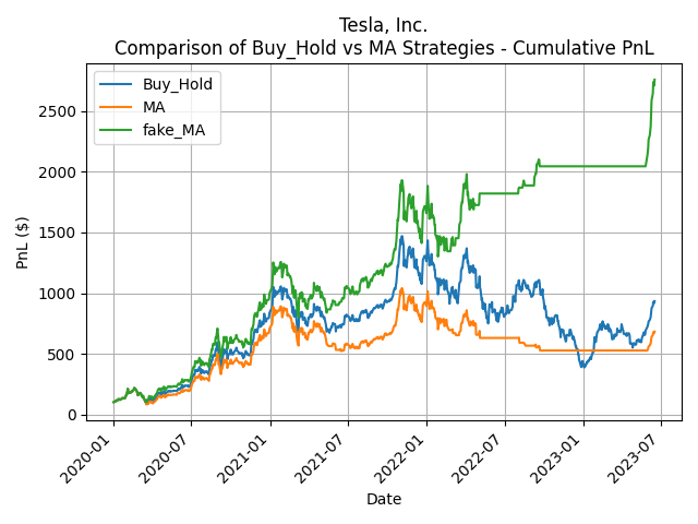
When examining the performance of the fake SMA, real SMA, and buy-and-hold strategies in a single plot, a distinct disparity becomes even more evident. The green line corresponds to the wrongly backtested SMA profit frequently emphasized in investment videos, particularly those aiming to entice viewers into paying for investment lessons. It portrays remarkably higher returns, potentially creating unrealistic expectations. In contrast, the orange line represents the correctly backtested SMA profit, a perspective seldom disclosed by individuals within the investment community. The contrast between the two lines emphasizes the exaggerated claims made by some individuals in the investment community. It highlights the need for critical evaluation and scrutiny when encountering investment advice.
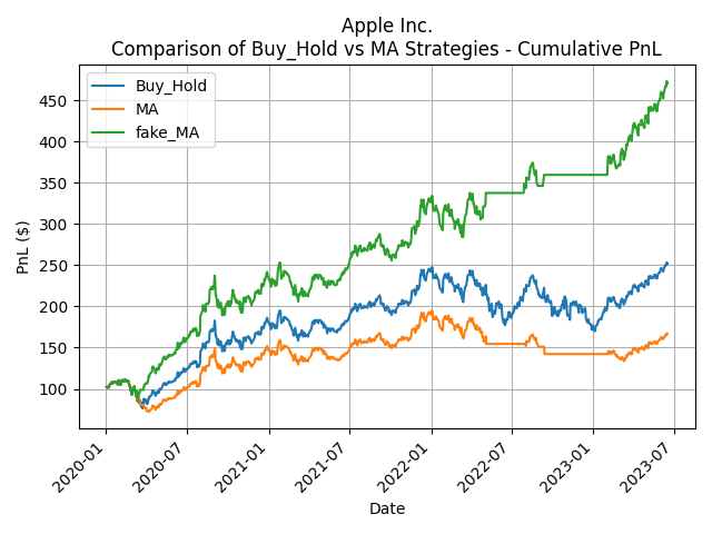
After conducting tests on this moving average strategy with other technology stocks (Microsoft, Amazon, Apple, ...), it has become apparent that this approach does not always enhance performance compared to simply holding the stock throughout the given period. Certainly, the strategy's performance falls considerably short of the claims made by many investment gurus on YouTube.
If this piques your interest, and you want to try it out with other stocks as well, you can always just use this code and replace the variable called “Ticker” with another stock. The code always update you with the up-to-date prices from Yahoo Finance. Also, if you are interested in the results for a different SMA window than 200 days, you can always just use this code and replace the variable called “ma_window” with another range.
To this end, this backtest framework can be used for testing other trading strategies, or even training AI models on it in the future. It again shows we become much more resourceful to solve real life problem with the help of Python programming.
Check my code in GitHub:
Source code
Or you can find the main code here below:
import yfinance as yf
from datetime import datetime
import matplotlib.pyplot as plt
import os

"""
# retrieve historical data from Yahoo Finance
"""

# Define a start date and End Date to retrieve the historical data from Yahoo Finance
start = '2010-01-01'
#setting today date as End Date
end = datetime.today().strftime('%Y-%m-%d')

# Define the ticker symbol for the NASDAQ 100 index or the tech stocks
# ticker = '^NDX'
# ticker = 'TSLA'
# ticker = 'MSFT'
ticker = 'AAPL'
# ticker = 'AMZN'
# ticker = 'GOOG'
# ticker = '0700.HK'
# ticker = 'NFLX'

# Create a Ticker object for the desired ticker symbol
ticker_y = yf.Ticker(ticker)

# Get the short name of the ticker
company_name = ticker_y.info["shortName"]

# Download historical data for the NASDAQ 100 index from Yahoo Finance
download_data = yf.download(ticker, start=start, end=end)

"""
# calculate moving average and daily returns
"""
stock_data = download_data[['Close']].copy()
# rename column name to 'price'
stock_data.rename(columns={'Close': 'price'}, inplace=True)

# Calculate the 200-day moving average
ma_window = 200
stock_data['moving_average'] = stock_data['price'].rolling(window=ma_window).mean()

# Calculate the daily returns
stock_data['daily_return'] = stock_data['price'].pct_change()
stock_data['daily_return'] = stock_data['daily_return'].fillna(0)

"""
# calculate the trading signal
"""

# Create a new column to store the trading signal
stock_data['signal'] = 0

# Apply the trading signal logic based on 200d MA
stock_data.loc[stock_data['price'] >= stock_data['moving_average'], 'signal'] = 1

# Calculate the daily returns based on the trading signal
stock_data['signal_return'] = stock_data['daily_return'] * stock_data['signal'].shift(1)
stock_data['fake_signal_return'] = stock_data['daily_return'] * stock_data['signal'].shift(0)

# slice the data to plot pnl from 2020-01-01 to today
stock_data_slice = stock_data.loc['2020-01-01':]


# Calculate the cumulative returns
stock_data_slice['cumulative_signal_return'] = (1 + stock_data_slice['signal_return']).cumprod()
stock_data_slice['fake_cumulative_signal_return'] = (1 + stock_data_slice['fake_signal_return']).cumprod()

# Calculate the PnL for the MA strategy, assuming we invest $100
stock_data_slice['MA_PnL'] = stock_data_slice['cumulative_signal_return'] * 100
stock_data_slice['fake_MA_PnL'] = stock_data_slice['fake_cumulative_signal_return'] * 100

# Calculate the PnL for Buy and Hold investment strategy, assuming we invest $100
stock_data_slice['cumulative_return'] = (1 + stock_data_slice['daily_return']).cumprod()
stock_data_slice['Buy_Hold_PnL'] = stock_data_slice['cumulative_return'] * 100

"""
# make plots
"""

images_folder = 'images'
os.makedirs(images_folder, exist_ok=True)

# Plot prices and the moving average
plt.plot(stock_data_slice['price'], label='Price')
plt.plot(stock_data_slice['moving_average'], label=str(ma_window)+'-day Moving Average')
plt.title(company_name + '\nPrices and '+str(ma_window)+'-day Moving Average')
plt.xlabel('Date')
plt.xticks(rotation=45, ha='right')
plt.ylabel('Price')
plt.tight_layout()
plt.grid(True)
plt.legend()
plt.show(block=False)
plt.savefig(r'{}\{}_{}ma.png'.format(images_folder, company_name, str(ma_window)))
plt.close()

# Plot the cumulative PnL for both the Buy-Hold and MA strategy
plt.plot(stock_data_slice['Buy_Hold_PnL'], label='Buy_Hold')
plt.plot(stock_data_slice['fake_MA_PnL'], label='fake_MA')
plt.title(company_name + '\nComparison of Buy_Hold vs MA Strategies - Cumulative PnL')
plt.xlabel('Date')
plt.xticks(rotation=45, ha='right')
plt.ylabel('PnL ($)')
plt.tight_layout()
plt.grid(True)
plt.legend()
plt.show(block=False)
plt.savefig(r'{}\{}_{}ma_pnl1.png'.format(images_folder, company_name, str(ma_window)))
plt.close()

# Plot the cumulative PnL for both the Buy-Hold and MA strategy
plt.plot(stock_data_slice['Buy_Hold_PnL'], label='Buy_Hold')
plt.plot(stock_data_slice['MA_PnL'], label='MA')
plt.title(company_name + '\nComparison of Buy_Hold vs MA Strategies - Cumulative PnL')
plt.xlabel('Date')
plt.xticks(rotation=45, ha='right')
plt.ylabel('PnL ($)')
plt.tight_layout()
plt.grid(True)
plt.legend()
plt.show(block=False)
plt.savefig(r'{}\{}_{}ma_pnl2.png'.format(images_folder, company_name, str(ma_window)))
plt.close()

# Plot the cumulative PnL for both the Buy-Hold and MA strategy
plt.plot(stock_data_slice['Buy_Hold_PnL'], label='Buy_Hold')
plt.plot(stock_data_slice['MA_PnL'], label='MA')
plt.plot(stock_data_slice['fake_MA_PnL'], label='fake_MA')
plt.title(company_name + '\nComparison of Buy_Hold vs MA Strategies - Cumulative PnL')
plt.xlabel('Date')
plt.xticks(rotation=45, ha='right')
plt.ylabel('PnL ($)')
plt.tight_layout()
plt.grid(True)
plt.legend()
plt.show(block=False)
plt.savefig(r'{}\{}_{}ma_pnl3.png'.format(images_folder, company_name, str(ma_window)))
plt.close()

print('Done')